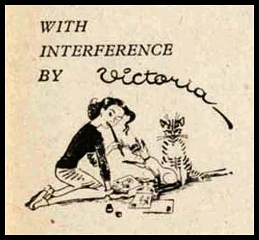
VICTORIA DAVIDSON, WORK FOR LILLIPUT
The 'Gulliver' feature at the beginning of the magazine Lilliput regularly introduced its eponymous hero, gigantic and wide-eyed, to the phenomena of contemporary life in England, the Spiv, the Flea Trainer, the Bank Manager, the Petty Criminal. London Opinion led with a pop-eyed middle aged lecher whose only use was to register lust at the pouting Popsie. Until it was dropped in a re-design in the early fifties the Gulliver feature was illustrated by "Victoria" whose characteristic signature with its curliques and eccentric dots, identified the artist of the major lead picture, of the pair of images on the next double page spread, and, if you were lucky, of a small vignette at the end of the piece. The paper stock was of the post-war magazine was coarse and prematurely yellowed. Yet the cunning line, and compelling detail of her work was astounding. Even when scanned large, the art and artifice becomes more impressive. So who was 'Victoria'? Victoria Davidson was born in Germany and was originally trained as a fashion designer. Her careful delineation of fold and furbelow, laces and cuts of cloth would suggest something of this. Only with her characters' shoes is she less than inventive. She came to England in 1935, working on magazine layouts and as a freelance cartoonist. Her early work for Lilliput is confident in line and composition, and shows a keen awareness of the foibles of British behaviour, and, most noticeable, idioms and nuances of language. Her Orator stands on a wooden box marked "Soft Soap". From the evidence of what I have found, she worked in pen and ink, but also in Scraperboard. The latter gives her work an extra dimension - chunky and sleek massing of black forms with delicated details of expression and gesture picked out in white line. Her drawings are endlessly inventive, responding to the sharp detail of the editorial matter. Every now and then the humour reveals a certain central European macabre, a Grimmish tone on the post-war street scenes of old England. Her formal games differ in each monthly issue. Look above on this screen and see how Gulliver's Tricorn hat casts a shadow over his face like a highway man's mask. This quality of invention and sudden switches from observation to whimsy are well worth close study. There are terrific opportunities for the artist to play with scale, and Gulliver himself has a remarkable ability to change his size according to the narrative demands. Tom Eckersley told me that he regretted much of his work in the late Forties where the cast of graphic characters would smile in a monotonously cheerful way to bolster viewers' morale . He admitted to a certain lack of variety in expression, and a certain lack of surprise. I would argue that other illustrators of the period colluded in this. Victoria is unusual in the variations of characterisation she deploys, with an edge of the sinister and the grotesque which others found uncomfortable. The Flea Trainer is a joy. She was a prolific contributor to advertising campaigns of the 1950's to which her signature alas was rarely appended. But you know it's her. She seems to have found much satisfaction as a designer for Posters (and London Transport in particular). The London Transport Museum's website mentions her work in embroidery and textiles. Chris Beetles offers some originals for sale in his Gallery, including one scraperboard for Gulliver and the Nudists. She died in 1999. I don't have a complete run of Lilliput, but that which I have is here scanned as evidence of her contribution to the magazine, and to British Visual Arts in general.
|
back
