 |
 |
 |
 |
|||||||
 |
 |
 |
||||||||
 |
 |
 |
||||||||
 |
 |
 |
||||||||
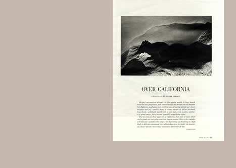
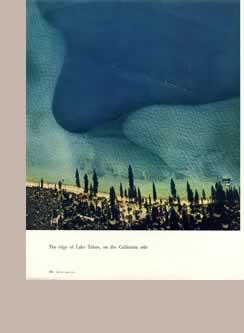
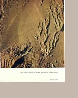
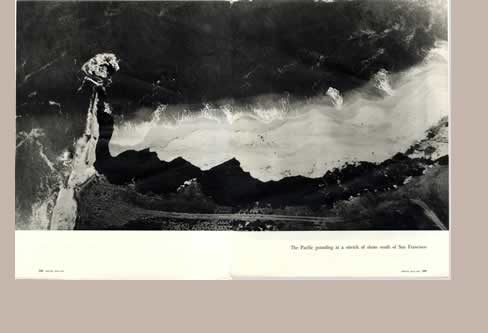
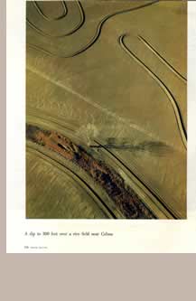
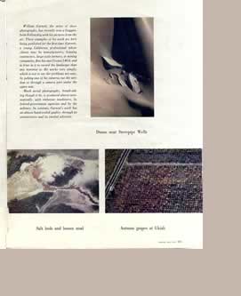
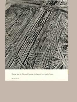
This portfolio sums up in many ways the visual changes the magazine was undergoing with Lionni and (maybe in permanent conflict) Walker Evans. Perhaps this feature by a friend of Evans was an initiative independent of the art director. It has Evans' own text on the first page. It sums up Evans' belief that photographs should be bigger and simpler on the page, but full of surprising and unsual details. The balance of colour and black/white imagery is telling, the whole an exhilarating rhythm that begins, developes and terminates. All in 1954. Compare for example Evans' intricate page construction on his 1948 portfolio on Chicago. Typically Evans seeks to emphasise Garnett's youth, and the hand crafted nature of his work (rather than the mechanistic nature of the usual industrial aerial photography. |