 |
 |
 |
 |
||||||
 |
 |
 |
|||||||
 |
|||||||||
 |
|||||||||
 |
|||||||||
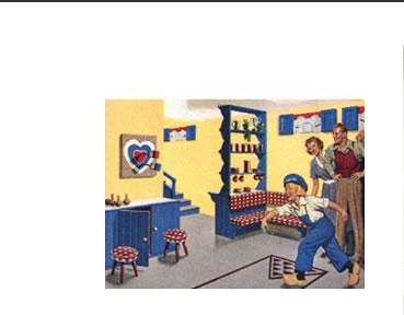
Brand Characters : Graphic Identity left - National Lead Company October 1951, 18 x 24cms. This is one of my great favourites - the Dutch Boy Paints and Enamels' eponymous, surely the only boy in Fifties America allowed long hair cut in a fancy way. Some of the depictions I have in the archive are toe-curlingly camp. Here is the little chap amusing himself by hurling his paintbrushes at a target in his freshly painted wall. The man of the house stands arms akimbo amused but reluctaant to join in. The woman appears more sympathetic while an elderly man appears as a kind of second head and laughs with his mouth open - a sure sign of senility. But that Dutch Boy puts his very heart into his target practice. I cannot imagine the written form in which this commission reached the illustrator. Underneath is the slogan "Save the Surface and You Save All" an inspired piece of Total Fluff. Main Copyline, "For Rooms That say - Your Hearts are Gay -"
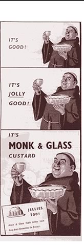
middle - Here the artwork verges dangerously towards the cartoon - the Monk and Glass Custard ads with the corpulent greedy monk drooling at the spectacle of custard as if it were Brandy. The Brand Character Monk is a standard feature of British advertising, and probably most revealing of the British national character - Royal Academicians formed lifetime careers from the subject (Dendy Sadler) . The copy apes "DU... DUBON...DUBONNET" but the only fuel to the ad is Custard. A cartoon monk can be disregarded - here is just enough tonality to establish a rounded personality. May 1951, 10 x 26cms. There is a stolid inevitability to the pacing of three frames towards the final clarion call of the product (Custard, remember). The ponderous pacing is revealed by the copyline - so typically british of the 50's - "Monk and Glass Table Jellies have long been favourites for flavour." Write that in three words.
|